Friday, May 25, 2012

International Towel Day 2012

First of all, yes, it's a real thing.

International Towel Day is celebrated each May 25. It's a memorial to author Douglas Adams (the increasingly mis-named Hitchhiker's Guide to the Galaxy trilogy) As a tribute, some fans carry a towel with them to demonstrate their appreciation for the books and the author. The first Towel Day was two weeks after Adams' death on May 11, 2001.


And a quote:
... a towel has immense psychological value. For some reason, if a strag (strag: nonhitchhiker) discovers that a hitchhiker has his towel with him, he will automatically assume that he is also in possession of a toothbrush, washcloth, soap, tin of biscuits, flask, compass, map, ball of string, gnat spray, wet-weather gear, space suit etc., etc. Furthermore, the strag will then happily lend the hitchhiker any of these or a dozen other items that the hitchhiker might accidentally have "lost". What the strag will think is that any man who can hitch the length and breadth of the galaxy, rough it, slum it, struggle against terrible odds, win through, and still knows where his towel is, is clearly a man to be reckoned with.
-- Douglas Adams, The Hitchiker's Guide to the Galaxy, Chapter 3

Thursday, April 5, 2012

creepy birds

Dear Churches,

Never do this to your website.
Ever.

FAIL (the browser should render some flash content, not this).


Never.
That is all.

Friday, March 23, 2012

Godzilla Explained

Somehow I felt obligated to explain Godzilla.

(click to enlarge)

Probably because my friend Tedd posted this video on facebook today:

Thursday, March 15, 2012

Everyone is Irish

On March 17 everyone gets to claim their Irish heritage, no matter how fictitious.
I can think of no better way to celebrate than with this classic melody.

Wednesday, March 14, 2012

Creepy Symmetry

OK - here's a weird thing about my brain.

At lunch today I had an apple that was leaning off to one-side and I thought - hmm not very symmetrical.
Then I remembered a Newsweek Magazine article from about 15 years ago that described how symmetry had a lot to do with what we perceive to be beautiful. They showed actors' and actress' faces that were split up the middle and superimposed on the other side to show how symmetrical or not they were.

I haven't found the article, but I did find a write-up about the article.
Write up referencing The Science of Beauty: Newsweek, June 3, 1996

OK - so then I thought to myself... huh... I wonder if my face is symmetrical or not... or how far off or what?


So then I made this...
Me - Right-side Symmetry - Left-side Symmetry

OK - that creeps me out a little.

And it turns out there's a wacky symmetry tool out there that would have helped.

Monday, March 12, 2012

Facebook posts from history

So, it turns out there's a whole book full of these things, but I really had fun making them to go with this date in history. Hopefully, they are funny enough to inspire people to look up the event on their own.

March 8, 1917

March 9, 1796

March 10, 1947

March 11, 1942

March 12, 1930

Friday, March 2, 2012

lousy puddle

See this puddle in the parking lot?
Yeah.
I had my weekly Bible study in this bar. Shut up, it's where I have Bible study, and sweet tea. So, I'm walking out with my friend John and we're heading for our cars, just minding our own business, and sure enough...

stepped right in it!
It's no bigger than my foot. And yet - in that whole parking lot - I. walked. right. into. it.
Got a soaker too.

Gah!!!


/rant


Tuesday, February 28, 2012

Just Say No to Comic Sans and Papyrus

Can someone really hate a font?
How about two fonts?
The answer is unequivocally, yes.

If you've spent any time near churches or schools, you know the font all too well. It's part of the sad set of fonts that came with Windows 95, and later Microsoft Office 97, and were immediately over-used by "creative types". Sadly, they are both over-present in culture today and have been used for businesses, signs and brands. One could say the same for Hobo (thank you Kevin), Curlz MT, Jokerman LET, and of course Wide Latin. It's easy to simply cast blame and point at Windows 95/Office 97 as the cause of the downfall of humanity, but let me elucidate.

In the olden days, Windows 3.1 came with only a handfull of fonts:
  • Arial
  • Courier New
  • Symbol
  • Times New Roman
  • Wingdings

You had the sans-serif font (without the little feetsies on the letters), the system font, symbols needed for proper annotation, the serif font (with the little feetsies on the letters), and some additional images as fonts for creativity.

Now comes Windows 95 and their fonts. Win95 included the Win3.1 fonts and added just one more:

Comic Sans


Comic: reminiscent of the hand-lettering used in comic books for many years
Sans: meaning Sans-Serif - without the serif

It was built for a specific use in 1994 but wasn't ready in time. It was meant to appear in the talk-bubbles of Microsoft Bob - a precursor to Clippy, and according to the font's creator, Vincent Connare, it was never to be released for general use. (read V. Connare's notes about Comic Sans)

And then came Microsoft Office 97 Small Business Edition Service Release 2. This seemingly innocuous upgrade contained a stack of fonts including French Script, Lucinda, Matisse, Mistral and Papyrus.


Before this, desktop publishing was a mysterious beast that roamed the forests and hills and was only seen on Macs in studios with things like laser printers, paste-up boards and wax rollers. Suddenly, seemingly everywhere, signs popped up that looked like Ransom notes or a military issued Stencil. The professional design community was open to this, now that an inexpensive Windows PC with basic MS Office could replace some of their high-end Macintosh design machines. However, there was an insidious double-edged sword. Office staff could now create their own items and pass them off as "design".

Posters, newsletters and tri-fold brochures ran rampant with 4 or even 5 fonts on a single page. (don't even get me started on the invention of Word Art) Designers lost jobs as the demand for their services waned and companies simply had the office assistants make these pieces. Then, with "Desktop Publishing" on their resumes, those one-time clerks sought jobs at billboard and sign companies and put their font libraries to use there. Instead of hiring marketing and design firms, companies hired people with no artistic training or experience to create their brands.

With that history lesson in mind I take you to the reasons why one would use a particular font over another. Fonts set the mood as much as a color does. A font can convey intention, atmosphere, experience, exuberance, cynicism and joy. Choosing a font - just because it looks cool is similar to using a didgeridoo in a rock concert because it's the fashionable thing to do. Using a font that was hugely over-popular from 1995-1998 is also kind of like listening to your late 90's music and calling it "hip". It's been nearly 15 years people, time to let it go. That is, unless you're putting text in a talk-bubble, but there are many other fonts to do an even better job.

In addition to the simple over-use, Comic Sans and Papyrus communicate a very specific tone. Comic Sans looks childish, informal, and playful. Papyrus looks aged, mysterious and distressed. Yet, these fonts are used willy-nilly for the most inappropriate purposes.
Comic Sans on a grave marker?
Papyrus on a Credit Union sign?
Because they are over-used and used so poorly, the use of the fonts have come to communicate something about the person who used them. They say, "unimaginative," "unprofessional," and "irrelevant."

So, if you use either of them - it's just good for you to know that your work will be mocked, and you will be perceived as incompetent. Please, for your own sake, if for no other reason, stop using them now.


Thank you.

Sunday, February 26, 2012

Another T-Shirt

Sometimes I feel like I live on Social Networks. My profile on most of them reads like this:
"Tweeting from stoplights since 2006: voice actor, speaker, strategery, interwebz bible guy, displaced Bears and Cubs fan, I have a lot of t-shirts"

I spent yesterday touring Amish country in Lancaster County, PA. Towns with names like Blue Ball and Intercourse leave me nowhere to go but easy jokes, and... More T-shirts.

Thursday, February 16, 2012

olden days

I used to write on this blog all the time. I used to publish every week and even had a "what's wacky this week" tagline. So, what happened?

Facebook...
Twitter...
I'm posting there all the time and neglecting this, my first foray into what would become social networking.


So, let me look back at a few recent posts over there and see if they measure up.
First - an explanation of social media for the uninitiated.


Gotta pick on Canada a little bit


Squirrels just crack me up.


and it was Valentine's Day


and a short Twitter conversation

Friday, January 13, 2012

This is the story of the MirthMobile.


Garth's little blue pacer showed up first in Wayne's World (1992). You may remember the guys singing along with Queen's "Bohemian Rhapsody" while driving around Aurora.


In 1993, I took delivery on this little beauty, the Eagle Summit Wagon. My friends immediately dubbed it "The MirthMobile" and I had no problem with that. I eventually got a MIRTH license plate, and registered MirthMobile.com in 1998.


In 2001, the blue PT Cruiser took the Summit's place and got just a little Mirth-ier. The little guy made it to PA when I moved in 2008.


GRUNT!
The 2006 Toyota Rav4 took over on New Years Eve 2009. This version had 4-wheel drive and an awesome sound system. One day it started making an awful noise. I got it checked out and they couldn't find anything. Then it got worse. They couldn't find the cause and suggested I drive it until it got really bad. I disagreed.


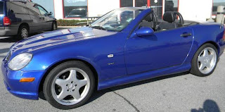
Rather than let it fail, I traded it on New Years Eve, 2011 for this mid-life crisis. A 2000 Mercedes hard-top convertible. It was really fun to drive until I realized that it really wasn't "me" - and had no back seat - AND couldn't fit my bass amp in the trunk. Back to the dealer it went.

I drove away with the exact opposite two days later. This 2008 Honda Civic Hybrid was the nerdiest of the MirthMobiles. I contemplated painting it blue until I took a road trip. My butt hurt. I'm sorry, but it did. It wasn't my back, it was my butt, and it hurt. I took it back.


And then the 2012 Nissan Juke. It's a good fit. It's fun to drive. It's mirthy. It's the end result of 4 cars in 8 days. How's that?
  • Rav4 12/31
  • Mercedes 12/31
  • Honda 1/2
  • Juke 1/6
That's how!
So how was that possible? It's Wacky.
Financially - the trades from Rav4 to Honda were even trades. I came out ahead on the Mecedes and back where I started with the Honda. Trading that up to the Juke did increase my debt, but not by much - AND - I'm getting a refund on the extended warranty so it's even less. I don't like debt, but I feel OK with this.

Finally, I'm back in a real MirthMobile. The Honda? - no. The Mercedes? - not really. Even the Rav4 was not so mirthy. The Juke... well... the name says it. The funny thing is that it's so very much like my "1982 Dream Car" - the AMC Eagle SX/4. My 14 year old self knew me well.
ta da.


Now... should I get the flames magnet?

Anyone want to give me the $35?


----------
Juke: Football
v. To deceive or outmaneuver (a defending opponent) by a feint; fake.
n. A feint or fake.
[Middle English jowken, to bend in a supple way.]